Last week, the Caribbean Court of Justice upheld the order of operations from mathematics and, in doing so, caused the government of Guyana to fall. TTT News describes the aftermath of the appellate court's decision.
The case on which the CCJ ruled goes back to 21 December 2018, when in an extraordinary effort to survive a no-confidence motion and remain in power, Guyanese President David Granger attempted to legally redefine how a valid majority of votes in the 65-seat Guyanese Parliament should be calculated, raising the threshold from 33 votes to 34, which would allow his party to dismiss the results of the body's 33-32 no-confidence vote that went against them.
The case had gone to the CCJ after a judicial panel in Guyana ruled in favor of the government's bad math.
The President of the Caribbean Court of Justice (CCJ), the Honorable Mr. Justice Adrian Saunders, delivered the opinion of the court regarding the no-confidence vote held in the Guyanese Parliament on December 21, 2018, which the court held to be valid under the Constitution of Guyana. The Court’s decision upholds the decision of the Speaker of the National Assembly, Dr. Barton Scotland that the motion was carried by a majority of 33 votes. The contention between the parties was whether 33 or 34 votes constituted a majority. The Attorney General, Mr. Basil Williams, contended that the formula for achieving a majority, as like in other Parliamentary systems with an odd number of representatives, that the majority constitutes one half of the members plus one, which would hold that 34 votes are required to form a majority....
The resulting no-confidence vote by a majority of the 65 member National Assembly against the coalition government requires the government, including the President and his cabinet, to resign immediately and to hold new elections within three months.
The ruling party's position depended upon erroneously applying the order of operations from mathematics. In a 29 March 2019 letter to the Guyana Times, economics and statistics professor Dev Rawana explained why the lower judicial panel's ruling was wrong:
The controversial Appeal Court’s ruling against the No Confidence Motion (NCM) resolves around the meaning of the word “majority” as intended by Article (106). No one in the Appellate disagrees that the greater number in the National Assembly constitutes a majority. The median or the 50th percentile of a set of numbers, by statistical and mathematical reasoning, is half the sum of all numbers plus one, or equivalently ½(n+1).
In the case of the fifty (52) Members of Parliament of the Republic of Vanuatu, one half of 53 (26.5) and then rounded up yield 27 as the majority. In the case of Guyana with 65 sitting Members of Parliament, one half 66 (65+1) is 33, the number that constitutes the majority as in the case of the Republic of Vanuatu.
However, in the Guyana case, the median was not applied. Instead, Chancellor Cummings-Edwards and Justice Gregory disaggregated the median formula into two overlapping stages to define the majority by taking one-half, rounded-up and then plus one to yield a majority of 34. This two-stage hybrid is mathematically and statistically flawed by international standards.
Why? In the first stage, the number is rounded-up, and again the rounded value is added to one to overstate the majority by one. Therefore, based on the median principles in determining the 50th percentile, 33 is the majority of 32 in the 65-Member Parliament; and, reflects the true effect of the constitution.
The correct application of the order of operations in calculating what constitutes a majority in the Guyanese Parliament that Professor Rawana describes is what the Caribbean Court of Justice upheld in its ruling confirming the success of the no-confidence motion. Guyana's next government will now be determined by the outcome of elections to be held in the next three months.
Previously on Political Calculations
Following up our analysis of the market for existing homes in the U.S., preliminary and revised data suggests that falling mortgage rates have coincided with a reversal in the late-2018, early-2019 decline in new home sales.
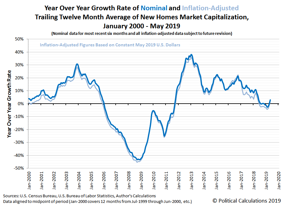
The following chart tracking the trailing twelve month average of the market capitalization of new home sales in the United States shows that rebound taking hold April and May 2019.
Market capitalization is the product of average new home sale prices and their number of sales. Looking next at the year-over-year growth rates for the trailing year average new home sales market cap in the next chart, we find that the latest data suggests the new home market has begun to rebound back into positive growth territory, while slightly older data has been revised upward to not be quite as negative as initial data previously indicated.
That sales rebound is occurring even though the average and median sale prices of new homes has been trending downward over much of the last year. The next chart shows the raw average and median sale prices of new homes in the U.S.
Considering median new home sale prices, that downward trend becomes more clear when we calculate the trailing twelve month average of the raw data presented in this chart, which we've plotted against the trailing twelve month average of median household income in the next chart.
The combination of falling median new home sale prices and rising median household income means that new homes have been becoming relatively more affordable. The last chart shows that the median new home in the U.S. is now costing about 5.05 times the median household income, down from a peak of 5.45 in February 2018.
New home sales data can be revised as many as three times in the months following its first being reported. Annual data for new home sales in 2018 is now available, with a median sale price of $326,400 and an average sale price of $385,000, but annual data for median household income in 2018 won't be available until sometime in September 2019.
References
U.S. Department of Labor Bureau of Labor Statistics. Consumer Price Index, All Urban Consumers - (CPI-U), U.S. City Average, All Items, 1982-84=100. Accessed 12 June 2019.
U.S. Census Bureau. Median and Average Sales Prices of New Homes Sold in the United States. [Excel Spreadsheet]. Accessed 25 June 2019.
U.S. Census Bureau. New Residential Sales Historical Data. Houses Sold. [Excel Spreadsheet]. Accessed 25 June 2019.
Labels: real estate
Since peaking in late November 2018, mortgage rates in the United States have fallen sharply, dropping by more than a percentage point from a peak of an average of 4.87% to 3.83% in June 2019.
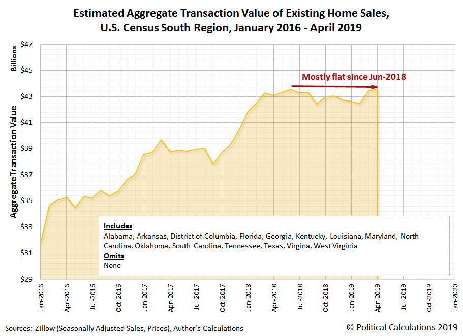
For existing home sales, the falling interest rates have roughly coincided with a rebound in the U.S. real estate market. The following chart shows the estimated aggregate transaction values for existing home sales in the U.S. (for 41 states and the District of Columbia) from January 2016 through April 2019, which represents the most recent data available from Zillow's databases covering state level residential real estate transactions.
Breaking these national aggregate sales totals down by U.S. Census region, we find the strongest rebounds have been taking place in the West and in the Northeast in the period since mortgage rates began dropping.
Meanwhile, the U.S. South and Midwest regions have seen flat to small gains in the total valuation of existing home sales within them.
We'll take a tour through individual states in the U.S. Census' South region in upcoming weeks, focusing on the states where the oil and gas industry accounts for a significant share of the state economies.
Labels: real estate
Among environmental activists, plastic bags have a very bad reputation, second only to Starbucks' plastic straws. Made of low-density polyethylene (LDPE), these bags are frequently freely given to customers by grocery stores and other retailers who buy goods in their establishments, which really upsets these political activists, who are calling for them to be banned.
There's just one problem. The plastic carrier bags they hate so much would appear to be much better for the environment than the alternatives these pseudo-environmental activists are pushing to replace them. Much, much better if the reports of a recent study is any indication:
The Danish government recently did a study that took into account environmental impacts beyond simply greenhouse gas emissions, including water use, damage to ecosystems and air pollution. These factors make cloth bags even worse. They estimate you would have to use an organic cotton bag 20,000 times more than a plastic grocery bag to make using it better for the environment.
Those results are summarized in Table IV of the executive summary of the study's results, which compares the relative environmental performance of LDPE carrier bags with their alternatives. We've built the following tool to make parsing the data presented in the table much easier for consumers who really care about the environment to make more informed choices when choosing how they might carry away their purchases whenever they shop. If you're accessing this tool on a site that republishes our RSS news feed, please click through to our site to access a working version of the tool.
Your goal in using the tool is to find a carrier bag option that returns a value of less than one, which would mean that it is better for the environment than a simple LDPE carrier bag when reused just once (most often to contain waste). If you get a value that is greater than one, that's the minimum number of times you would have to reuse your selected option in order for it to become a better option for the environment than using simple LDPE carrier bags.
That raises the question of whether the alternative bag options you've selected might last long enough to beat the LDPE carrier bag. In the case of a simple, unbleached paper bag, for example, the Danish study indicates it would take 43 reuses for it to improve upon the environmental impact of an LDPE carrier bag that is reused just once, which is unlikely since these bags are prone to tearing and other kinds of damage from handling that limit their effective lifespan when they are reused.
One factor not taken into account in the Danish life cycle assessment of LDPE carrier bags and their alternatives is the environmental impact of littering, which is considered to be a negligible issue in the country since Denmark has developed effective sanitation, litter control, and waste disposal technologies and services.
Perhaps if plastic bag-banning advocates cared more about the environment, they would be similarly effective if they put more personal effort and their own resources into developing those technologies in the regions that are the major contributors to human-created plastic waste in the environment.
Previously on Political Calculations
References
Ministry of Environment and Food of Denmark. Life Cycle Assessment of grocery carrier bags. Environmental Project No. 1985. [PDF Document]. February 2018.
Jambeck, Jenna R.; Geyer, Roland; Wilcox, Chris; Siegler, Theodore R.; Perryman, Miriam; Andrady, Anthony; Narayan, Ramani; and Law, Kara Lavender. Plastic waste inputs from land into the ocean. Science. Vol. 3476, Issue 6223, pp. 768-771. DOI: 10.1126/science.1260352.
Taylor, Rebecca L.C. Bag leakage: The effect of disposable carryout bag regulations on unregulated bags. Journal of Environmental Economics and Management. Volume 93, January 2019, pp 254-271. DOI: 10.1016/j.jeem.2019.01.001.
Edwards, Chris and Fry, Jonna Meyhoff. Life Cycle Assessment of Supermarket Carrier Bags. Report SC030148. Environment Agency. February 2011.
Labels: environment, tool
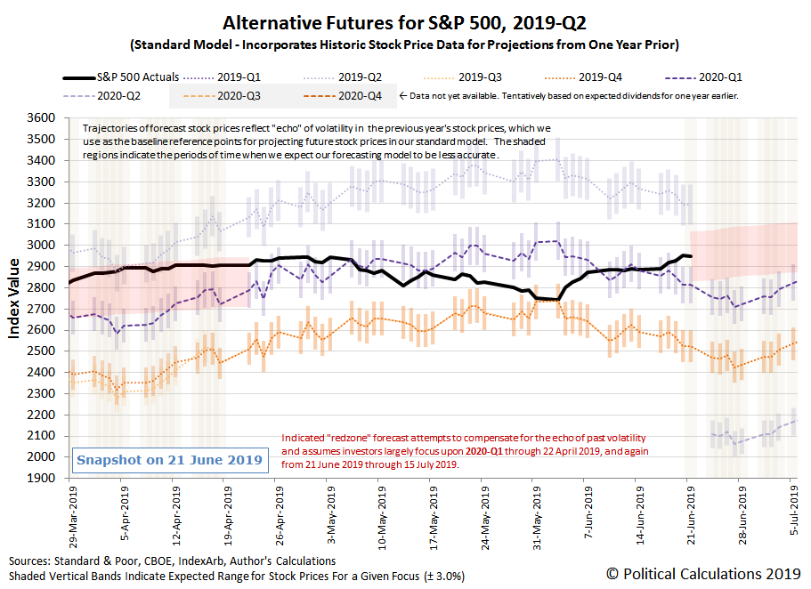
The S&P 500 (Index: SPX) reached new heights in the third week of June 2019 as the U.S. Federal Reserve's signaled it would soon begin slashing its Federal Funds Rate, lifted by the prospects the Fed may implement as many as four rate cuts happening between between the present and the end of the first quarter of 2020.
Although the odds of a Fed rate cut in 2020-Q1 dropped below 50% again on Friday, 21 June 2019, we think the potential for a fourth rate cut in March 2020 will continue to fix investors' attention on this distant future quarter, unless and until they might have a more compelling reason to reset their focus upon a different point of time in the future.
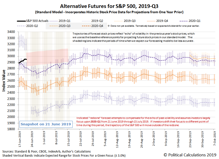
With that assumption in place, we've added a redzone forecast range to our alternative futures spaghetti forecast chart, where we would anticipate the S&P 500 to fall while investors set their focus on 2020-Q1 during the next several weeks while the echo of past volatility in stock prices affects the accuracy of our dividend futures-based model in projecting future stock prices.
And because we're so close to the end of 2019-Q2, which is already over where the quarter's dividend futures contracts are concerned, we'll take advantage of the opportunity to project the potential futures for the S&P 500 through the end 2019-Q3:
On the whole, the S&P 500 behaved predictably during the third week of June 2019. A big reason why that was the case was the flow of news during the week, where we flagged the following headlines as particularly newsworthy for their market-moving potential.
- Monday, 17 June 2019
- Oil prices fall 1% as economic worries outweigh tanker tensions
- Bigger stimulus developing
in Chinaall over: - China urges big lenders not to shun small non-banks after Baoshang's woes: sources
- China renames, restructures state railway giant in reform push
- Signs China stimulus getting traction: China's home prices growth fastest in five months, raises policy challenge
- Australia's central bank says 'likely' will have to cut rates again
- Faith in the Fed nudges Wall Street higher
- Tuesday, 18 June 2019
- Oil climbs over $1/bbl on U.S.-China trade deal hopes, Mideast tension
- Bigger stimulus developing
in Chinain Eurozone: - Major policy reversal: ECB will provide more stimulus if inflation doesn't pick up: Draghi
- Wall Street nears record as mood on trade again turns optimistic
- Wednesday, 19 June 2019
- Oil prices little changed despite U.S. crude stock draw
- Fed sees case building for interest rate cuts this year
- FOMC statement from June 18-19 meeting
- Instant view: Fed holds interest rates steady, sets up for cuts
- Traders bet heavy on Fed rate cuts ahead
- What changed for the Fed in seven weeks? Trade risks top the list
- Mexico first to ratify USMCA trade deal, Trump presses U.S. Congress to do same
- Stocks approach record as Fed soothes Wall Street's fears
- Thursday, 20 June 2019
- US oil surges 5.4% to settle at $56.65 after Trump says Iran made a ‘very big mistake’
- Bigger stimulus developing all over:
- Worried by US-China trade tensions, ECB considering new stimulus: Olli Rehn
- Indonesia Signals Rate Cut Is Coming Aas It Eases Reserve Ratio
- Australia : Australian shares hit 11-year peak on fresh rate cut hopes, NZ edges down
- Bank of Japan joins Fed, ECB in signaling easing if needed, keeps policy on hold for now
- China, U.S. trade teams to hold talks
- Rate-cut euphoria elevates S&P 500 to record high
- Friday, 21 June 2019
- Oil climbs on Iran tensions, stocks edge back from seven-week highs
- Bigger trouble developing in China:
- China Hit By "Significant Banking Stress" As SHIBOR Plummets To Recession Levels
- From Baoshang to trade wars to local government: Mapping China’s toxic debt
- Bigger stimulus developing in China all over:
- Fed officials face weak inflation, but split over what it means
- Fed's Brainard says risks bolster argument for lower-than-expected rates
- Fed's Kashkari calls for 50 basis point cut in U.S. rates
- Clarida: Outlook is for continued U.S. expansion, but Fed prepared to act
- Fed's Bullard says he dissented at Fed meeting on concerns over weak inflation, growth
- Bang-up week on Wall Street ends with a whimper
At the Big Picture, Barry Ritholtz identified 6 positives and 6 negatives in his review of the week's major economic and market-related news.
The S&P 500 will enter 2019-Q3 relatively near the ceiling for how high it can go with the current expectations for future dividends, which puts it into something of a danger zone. While it has some room to move up from its current record level, events that might cause investors to refocus on the nearer term future would likely coincide with sharp declines in stock prices as 2019-Q3 offers investors heightened risks.
If you've ever had to deal with a pair of earphones after they've become tangled, you know exactly what kind of mess they can make and what kind of pain they can be to untangle. Is there anything you can do about it?
Before we go any further, let's draw some lessons from science for how cords can almost spontaneously become tangled from the following video:
Now, let's get to the practical matter of finding out how likely your cords will become tangled. In the following tool, we've adapted the math developed by Dorian M. Raymer and Douglas E. Smith in their 2007 paper to calculate the probability that your cord/string/rope will become tangled, assuming that it is made of a medium-stiffness material, based upon its length. If you're reading this article on a site that republishes our RSS news feed, click here to access a working version of this tool!
If your cord has a relatively low probability of becoming knotted or tangled, say below 5 or 10%, you might not need to worry much about taking any special measures to keep it that way.
But, if you want to avoid the hassles that come from your cords becoming tangled, you might consider the suggestions from the video, using shorter, stiffer cords (if feasible) or getting smaller containers to store your longer cords (if not).
Meanwhile, if you're looking to learn more about knot theory, and yes, there is such a thing in maths, here's a quick introduction:
References
Raymer, Dorian M. and Smith, Douglas E. Spontaneous knotting of an agitated string. PNAS. October 16, 2007 104 (42) 16432-16437; https://doi.org/10.1073/pnas.0611320104. Note: For our tool, we corrected the L₀ parameter to be 1.025 after replicating the other parts of the authors' logistic function regression using the data presented in Figure 2, where our L₀ correction allowed us to replicate their reported probabilities for various cord lengths.
Labels: geek logik, math, physics, tool
The Federal Reserve chose to leave short term interest rates in the United States unchanged at the conclusion of its fourth two-day meeting of 2019 on 19 June 2019, holding its target range for the Federal Funds Rate between 2.25% and 2.50% for at least another six weeks, when the Fed will meet again to consider cutting the Federal Funds Rate.
According to the CME Group's FedWatch Tool, investors are betting the Fed will cut its Federal Funds Rate by a quarter point, giving a 100% probability of that happening at the next meeting. Following the Fed's June meeting, investors are now also betting the Fed will cut rates by another quarter point at the conclusion of its 18 September 2019 meeting, and again at the conclusion of its 11 December 2019 meeting, putting three rate cuts on tap for the remainder of 2019.
They are also giving a little higher than even-money odds that the Fed will cut rates again in March 2020, which would put the forward-looking focus of investors on that distant future quarter.
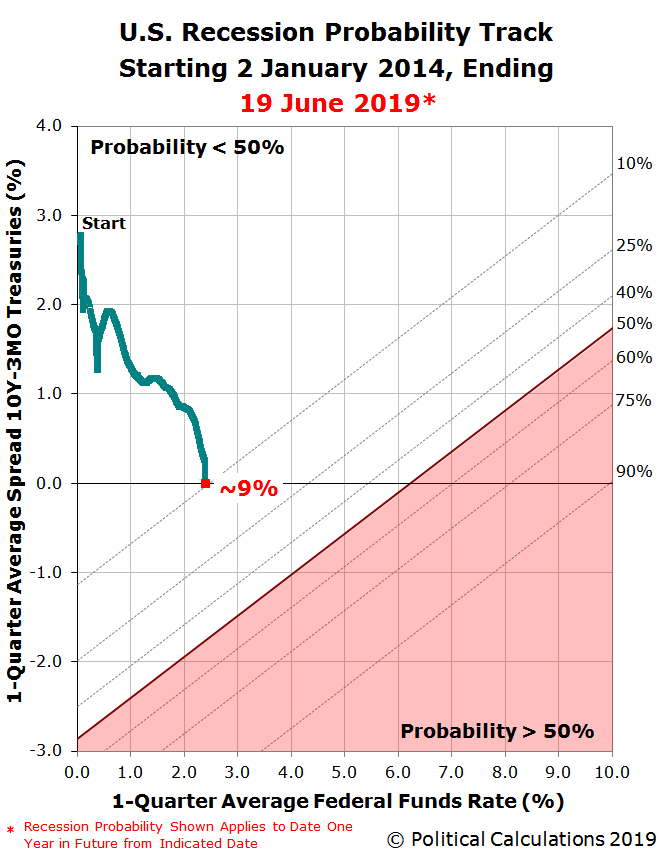
As for the odds of recession, there is now a one-in-eleven chance the U.S. economy will enter into a recession sometime between 19 June 2019 and 19 June 2020 (or really, before July 2020). The latest update to the Recession Probability Track shows these odds at roughly a 9% probability.
The Recession Probability Track is based on Jonathan Wright's 2006 paper describing a recession forecasting method using the level of the effective Federal Funds Rate and the spread between the yields of the 10-Year and 3-Month Constant Maturity U.S. Treasuries.
If you would like to run your own recession probability scenarios, please take advantage of our recession odds reckoning tool, which like our Recession Probability Track chart is based on Jonathan Wright's paper.
It's really easy. Plug in the most recent data available, or the data that would apply for a future scenario that you would like to consider, and compare the result you get in our tool with what we've shown in the most recent chart we've presented. We do just that, in fact, when we account the Fed's recent quantitative tightening monetary policies in our in-between Fed meeting updates, which would put the odds of an official period of recession starting before July 2020 much higher than what the "official" Wright methodology indicates.
If you would like to catch up on any of the analysis we've previously presented, here are all the links going back to when we restarted this series back in June 2017.
Previously on Political Calculations
- The Return of the Recession Probability Track
- U.S. Recession Probability Low After Fed's July 2017 Meeting
- U.S. Recession Probability Ticks Slightly Up After Fed Does Nothing
- Déjà Vu All Over Again for U.S. Recession Probability
- Recession Probability Ticks Slightly Up as Fed Hikes
- U.S. Recession Risk Minimal (January 2018)
- U.S. Recession Probability Risk Still Minimal
- U.S. Recession Odds Tick Slightly Upward, Remain Very Low
- The Fed Meets, Nothing Happens, Recession Risk Stays Minimal
- Fed Raises Rates, Recession Risk to Rise in Response
- 1 in 91 Chance of U.S. Recession Starting Before August 2019
- 1 in 63 Chance of U.S. Recession Starting Before September 2019
- 1 in 54 Chance of U.S. Recession Starting Before November 2019
- 1 in 42 Chance of U.S. Recession Starting Before December 2019
- 1 in 26 Chance of U.S. Recession Starting Before February 2020
- 1 in 16 Chance of U.S. Recession Starting Before April 2020
- 1 in 14 Chance of U.S. Recession Starting Before April 2020
- 1 in 13 Chance of U.S. Recession Starting Before May 2020
- 1 in 12 Chance of U.S. Recession Starting Before June 2020
Labels: recession forecast
There are two main sources we draw upon for peering into the future for dividends in the S&P 500 (Index: SPX). The first of these is a relative newcomer, the CME Group's S&P 500 Quarterly Dividend Index Futures Quotes, which indicates the projected amount of dividends expected to be paid out to investors from the current quarter out to the same quarter a year from now.
The second source we use is IndexArb's Dividend Analysis, which we've been tracking regularly since early 2009, although it has been around for much longer.
Both these sources are linked to dividend futures contracts, which for a given quarter, indicates the amount of dividends per share that will be paid out from the expiration of the dividend futures contract on the third Friday of the month ending the preceding quarter through the third Friday of the month ending the indicated quarter. By contrast, when Standard and Poor reports the dividends paid out to shareholders for its S&P 500 index for a given quarter, it reports the total amount paid out "per share" for the index for an entire calendar quarter.
That said, we're seeing some differences between the CME Group and Index for S&P 500 dividend futures, particular for the fourth quarter of 2019. The following chart shows what these sources are telling us to expect for dividends in each quarter of 2019, as of the dividend futures available on 18 June 2019:
It may not look like it from the 84-cents per share difference between the two figures, but when projecting the future for the S&P 500, the difference in expectations between these two sources would be magnified into a 200 point difference in the projected value of the S&P 500 should investors come to focus upon 2019-Q4 in setting current day stock prices, compared to what we presented earlier this week, all because our alternative futures chart reflects only the CME Group's futures data.
One or both of these two projections for 2019-Q4's dividends per share is wrong. Which do you suppose is more wrong?
Labels: dividends, forecasting
Just after the midpoint of 2019-Q2, we featured a chart showing that the number of dividend cuts that had been announced to date during the quarter was running well ahead of what had been recorded back in 2018-Q2 and was very nearly at levels that would indicate recessionary conditions were affecting parts of the U.S. economy.
It's almost a month later and, as you can see in the following chart showing the cumulative number of dividend cuts we've been able to sample during the quarter through Friday, 14 June 2019, the U.S. economy would appear to be catching some of its breath in the second half of 2019-Q2, where the pace of dividend cuts being announced has slowed considerably.
Here are the five firms we've added to our sampling of 2019-Q2's dividend cuts, all of which set their dividends independently of their revenues, earnings, or cash flow, even though three of the firms are Real Estate Investment Trusts (or REITs):
- Daktronics (NASDAQ: DAKT)
- Guess (NYSE: GES)
- Ellington Residential Mortgage REIT (NYSE: EARN)
- Anworth Mortgage Asset (REIT) (NYSE: ANH)
- Ashford Hospitality Trust (REIT) (NYSE: AHT)
The biggest change from earlier in the quarter has been the absence of oil and gas royalty trusts, where falling oil prices during the fourth quarter of 2018 led to dividends being cut during the first one-and-a-half quarters of 2019. Unfortunately, even though the price of West Texas Intermediate crude oil rebounded after its 2018-Q4 decline during 2019-Q1, those prices peaked and began falling again in late April 2019. Assuming a similar lag, we anticipate we'll see more dividend cuts from this sector of the U.S. economy from its distressed business environment in the upcoming months of 2019-Q3.
The other change we've seen during 2019-Q2 is an increase over 2019-Q1 for the number of financial firms and Real Estate Investment Trusts that have announced dividend cuts, which itself is a lagging outcome of the Federal Reserve's rising interest rates during 2018, whose effective level peaked in 2019-Q1. Since then, U.S. interest rates have begun to fall, dramatically in the case of mortgage rates, but short term rates remain elevated as firms that are sensitive to rate hikes are still shaking off the damage, which is why we're seeing this sector show up in the count of dividend cuts in higher numbers.
Overall, the pace of dividend cuts during 2019-Q2 through this point of time is on par with what we saw during 2019-Q1, where both quarters are well elevated over the same quarters in 2018. We'll wrap up 2019-Q2 in early July.
Until then, one important factor to realize is that while we focus on the U.S. in our analysis, the full scale of the story is much bigger.
References
Seeking Alpha Market Currents. Filtered for Dividends. [Online Database]. Accessed 14 June 2019.
Wall Street Journal. Dividend Declarations. [Online Database]. Accessed 14 June 2019.
Labels: dividends
After several weeks of volatility, the S&P 500 (Index: SPX) settled down during the second week of June 2019, as might be expected for when investors are focusing their forward-looking attention on the distant future quarter of 2020-Q1.
The reason they're doing that is because they are currently betting on the Fed cut U.S. interest rates three times between now and the end of that quarter: a quarter point cut coming soon in 2019-Q3, possibly as early as July, with at least one an possibly another two quarter point rate cuts by the end of 2019-Q4. The following snapshot from the CME Group's FedWatch Tool reveals these current expectations:
At this time, we think stock market investors are betting that third quarter point rate cut would more realistically happen in 2020-Q1 - if they anticipated that it was on tap for 2019-Q4, we would see stock prices decline sharply from their current level, similar to what happened in May 2019.
Speaking of which, if you've been following our S&P 500 chaos series over the past several weeks, you'll be very familiar with all the shifts in how far investors are looking into the future that have driven the recent volatility in stock prices.
We're just happy that it was a much quieter week with Fed officials having entered their communication blackout period ahead of the Federal Open Market Committee's upcoming two-day meeting on 18-19 June 2019 - the quiet before the storm for investors, so to speak, where investors kept their focus on 2020-Q1 because there wasn't any news to prompt them to shift their attention toward a different point of time in the future to continue driving more volatility into stock prices. Here are the headlines we picked out from the flow of news during the last week.
- Monday, 10 June 2019
- Oil falls 1% amid U.S.-China trade dispute, uncertainty on supply cuts
- Bigger trouble developing in China:
- China exports grow despite U.S. tariffs, but import slump most in nearly three years
- China May copper imports fall 10.9% on prior month: customs
- China May crude oil imports drop from record in April
- China May soybean imports fall on trade war, pig disease (this time of year, this is bad news for Brazil)
- Bigger stimulus developing
in Chinaall over: - China to boost funding support for projects as economy slows
- ECB policymakers open to cut rates if growth weakens: sources
- Wall Street rises on Mexico relief, Dow up a sixth day
- Tuesday, 11 June 2019
- Wednesday, 12 June 2019
- Oil tumbles on demand worries; stocks hit by trade, economic fears
- Bigger stimulus developing in China:
- China central bank to inject 35 billion yuan via OMO, resuming 28-day tenor: traders
- China bank loans rebound, more policy easing may be needed
- Muted U.S. inflation strengthens case for Fed rate cut
- Wall St. slips; banks fall with prospect of rate cut, energy drops
- Thursday, 13 June 2019
- Oil surges on tanker attacks; stocks rise on Fed rate cut expectations
- UAE says attacks on oil tankers are a 'dangerous escalation'
- U.S. blames Iran for tanker attacks in Gulf of Oman, Iran rejects assertion
- UK agrees Iran behind suspected tanker attacks in Gulf of Oman: BBC
- Wall St. climbs as oil jumps after Gulf tanker attacks
- Friday, 14 June 2019
- Oil rises but ends week lower on demand fears despite Mideast tensions
- Bigger stimulus developing
in Chinaall over: - China's May industrial output growth cools to 17-year low as trade war escalates
- Russian central bank lowers key rate to 7.5%, signals more cuts
- Wall Street ends down; Broadcom warning hits chip stocks
But wait, there's more! Barry Ritholtz counted 6 positives and 6 negatives in his review of the week's major economic and market-related news.
Otherwise, sharp eyed readers will recognize that we've added some additional vertical bands to the right hand side of the S&P 500 alternative futures "spaghetti" forecast chart above, when compared to previous versions. Because the dividend futures-based model behind this chart uses historic stock prices from 13 months, 12 months and 1 month earlier as the base reference points from which it makes its projections into the future, these vertical bands indicate the periods where the echo of past volatility in stock prices will affect the accuracy of its projections of the future. This is a direct consequence of the volatility the S&P 500 began to experience during May 2019, where the upcoming echo will lead our model's projections to undershoot the likely trajectory of the S&P 500, assuming investors remain focused on 2020-Q1.
With investors shifting their attention backwards and forwards in time frequently during the last month however, who knows how long that assumption might hold?
Warren Buffett is a legendary investor, one of the few who has consistent beaten the odds by beating the S&P 500 (Index: SPX), which has earned him the nickname "The Oracle of Omaha".
Buffett has attained that status by investing the resources of his company, Berkshire Hathaway (NYSE: BRK.A) in other companies, either buying their shares, as in the case of companies like Coca-Cola (NYSE: KO) and JPMorgan Chase (NYSE: WFC), or buying entire private companies, including household names such as See's Candy and Geico.
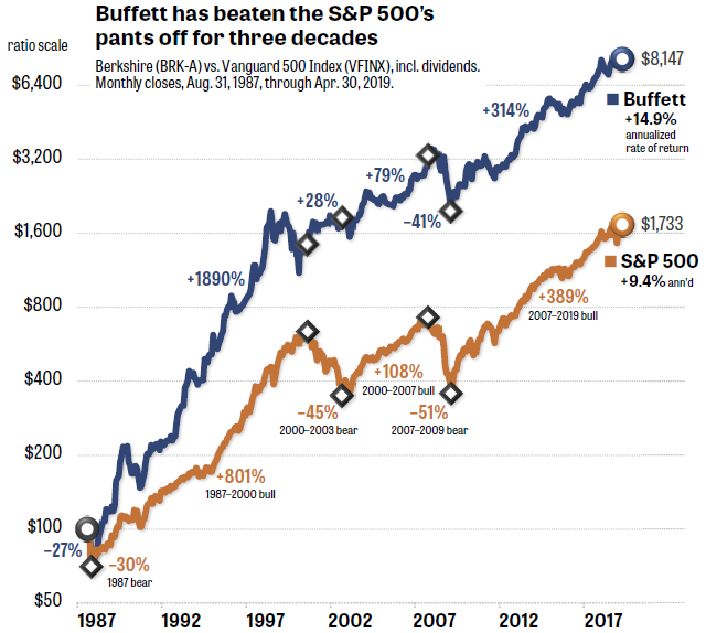
If you go back over 30 years, you can see that the cumulative value of Buffett's investments, as measured by Berkshire Hathaway's stock, has outperformed the S&P 500. Brian Livingston did just that, going back to 1987, in the following chart, which compares the total return of BRK.A against the total return of the S&P 500:
From 31 August 1987 through 30 April 2019, BRK.A has had an average annualized total return of 14.9%, while the S&P 500 has returned 9.4%.
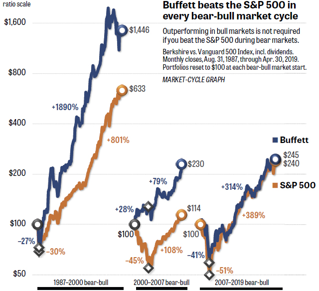
Livingston then did something in his analysis we don't see very often. He broke up Buffett's investment performance history into three major periods of interest, discovering something a lot of people miss about Buffett's track record as an investor. Most of his outperformance with respect to the S&P 500 came early in this period, where his ability to pick winning investments has declined over time, which you can see in Livingston's second chart:
Livingston makes the point in the chart that Warren Buffett bested the S&P 500 in each of these periods, but the thing that stands out to us is that the margin between the two has narrowed as the years have passed. To the point to where from 2007 to the present, Buffett's investing prowess has been consistent with the S&P 500's return, where whether he is beating the index depends almost wholly on random chance for how BRK.A stock compares with the S&P 500 on a given day.
It's no wonder then why the aging billionaire is leaving instructions for his estate to invest in the S&P 500 for the benefit of his survivors after he passes away:
The Oracle of Omaha even said he’s instructed the trustee in charge of his estate to invest 90 percent of his money into the S&P 500 for his wife after he dies, Buffett told CNBC’s Becky Quick in an exclusive interview on “Squawk Box” on Monday.
“There’s been no better bet than America,” he says.
Performing as well as the S&P 500 is so difficult that the index outperforms most active money managers. As diversified investments go over long time horizons, the S&P 500 is very hard to beat.
Previously on Political Calculations
We can now peer into the middle of 2020, where the following chart reveals what we find for the S&P 500's quarterly dividends per share from this point of time before the end of 2019-Q2 until then....
Although the trend after 2019-Q2 is rising, there's quite a lot of deceleration taking place in what investors expect for future dividends. Particularly when you look at the projected year over year change from 2019-Q2 to 2020-Q2.
Previously on Political Calculations
We last took a snapshot of quarterly dividend futures for the S&P 500 back in early January 2019, when we could only see as far as 2019-Q4. If you click through, you'll find that the dividend payout currently expected for the current quarter of 2019-Q2 is quite different from what was forecast earlier this year!
References
CME Group. S&P 500 Quarterly Dividend Index Futures Quotes. [Online Database]. Accessed 12 June 2019.
Standard and Poor. S&P 500 Index Earnings and Estimates. [Excel Spreadsheet]. Accessed 12 June 2019.
Labels: dividends, forecasting, SP 500
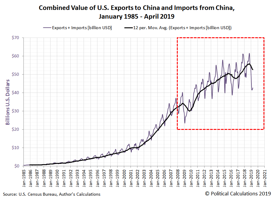
The combined value of goods and services traded between the U.S. and China continued to shrink in April 2019, with the cumulative gap between the projection of how much that trade would be worth today if not for the tariff war and where it actually is today now having increased by $1 billion over the past month to $7.4 billion.
The decline in the level of trade between the two nations is really only comparable to previous periods when one or both nations experienced declining rates of economic growth. The following chart shows how the chart above fits into the longer term trend for the full data series since it began being tracked in January 1985.
In the following two charts, we've broken out the underlying data that we used to produce these first two charts. First, showing the value of U.S. imports from China from January 1985 through April 2019, where we find that the of April 2019's has dropped to levels last seen in early 2016:
The next chart shows the value of U.S. exports to China over the same period, which has declined to levels last seen during 2010 and early 2011. Please note that the range of the vertical scale of this next chart is very different from the previous charts.
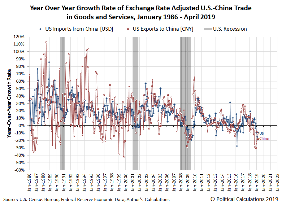
In our final chart, we've calculated the year-over-year exchange rate adjusted growth rate of U.S. exports to China and of China's exports to the U.S. We find that both are negative, with the U.S. growth rate of its direct imports from China being less negative than China's.
References
Board of Governors of the Federal Reserve System. China / U.S. Foreign Exchange Rate. G.5 Foreign Exchange Rates. Accessed 7 June 2019.
U.S. Census Bureau. Trade in Goods with China. Accessed 7 June 2019.
Labels: trade
Welcome to the blogosphere's toolchest! Here, unlike other blogs dedicated to analyzing current events, we create easy-to-use, simple tools to do the math related to them so you can get in on the action too! If you would like to learn more about these tools, or if you would like to contribute ideas to develop for this blog, please e-mail us at:
ironman at politicalcalculations
Thanks in advance!
Closing values for previous trading day.
This site is primarily powered by:
CSS Validation
RSS Site Feed
JavaScript
The tools on this site are built using JavaScript. If you would like to learn more, one of the best free resources on the web is available at W3Schools.com.

