Since order has broken down for the S&P 500 (Index: SPX), the past week has proven to be challenging for projecting the future for the index.
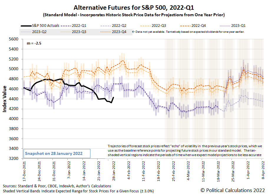
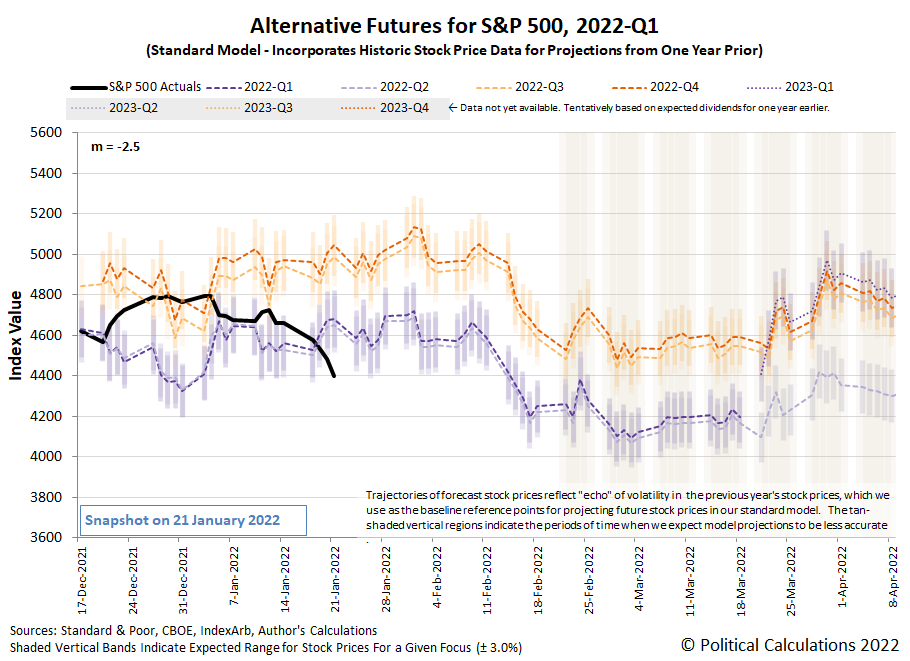
Here's an example of what we mean. The following chart illustrates the dividend futures-based model's alternative projections keeping all the same basic assumptions we've been using since 16 June 2021.
Going by this chart, the S&P 500's trajectory has fallen below the bottom end of the range we would expect if those assumptions still held.
But since this situation developed shortly before the Federal Reserve's Federal Open Market Committee's 25-26 January 2022 meetings, we have a unique opportunity to adjust the assumptions behind the model. That's because these meetings give us additional information we need to calibrate the model.
In this case, the additional information tells us exactly how far into the future investors are focusing their forward-looking attention. Thanks to the Fed's announced plan to accelerate the tapering of its purchases of treasuries that have been stimulating the U.S. economy and to start hiking short term interest rates, we confirm that investors are closely focused on the current quarter of 2022-Q1.
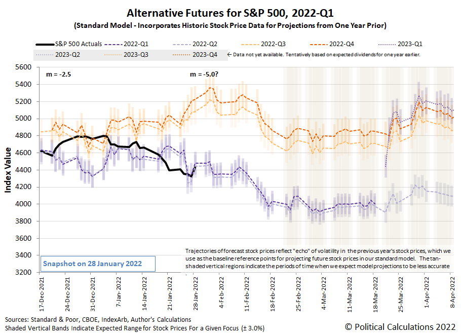
The announced change of monetary policies affects the dividend futures-based model by changing the value of m, the simple multiplier used in the model. The next chart shows the results we obtained when we matched the alternate future trajectory associated with investors focusing their attention on 2022-Q1 with the level of the S&P 500 on 26 January 2022 when the Fed officially announced its new monetary policy plans.
With a sample size of just three trading days since that event, it's still too early to tell if that will be a sufficient adjustment. The initial results are promising but we'll need many more days of trading to properly assess the model's performance.
In any case, our next calibration opportunity will come with the FOMC's next meeting six weeks from now. In between now and then, we'll have the random onset of new information to tell us how the model's multiplier might need to be adjusted. Here are the headlines that caught our attention for their market-moving potential, where we see the outsize role of the Fed in setting investor expectations and forward-looking focus during the past week.
- Monday, 24 January 2022
- Signs and portents for the U.S. economy:
- U.S. business activity slows in January amid Omicron wave -IHS Markit survey
- White House: Biden does not look at stock market to judge economy
- Anxiety over Fed tightening, Ukraine tensions sink stocks, oil
- U.S. puts 8,500 troops on alert to deploy amid Ukraine tensions
- Oil falls 2% as Fed rate hike talk spooks risk markets
- Fed minions being closely watched by market players:
- Fed tries to match economic risks against market's rush to tighten
- Fed could resort to outright asset sales to reduce balance sheet - Credit Suisse
- Bigger trouble developing in Eurozone:
- German economy likely shrunk in Q4: Bundesbank
- Euro zone recovery stumbled in Jan as Omicron hit services -PMI
- Bigger stimulus developing in China:
- ECB minions trying hard to set inflation expectations where they wan, but aren't sure about where inflation will go:
- ECB's Villeroy: ECB to do what is necessary to bring inflation around 2%
- ECB's Rehn expects euro zone inflation of around 2% in next two years -Handelsblatt
- Inflation outlook highly uncertain, ECB's Holzmann tells paper
- Wall Street closes higher in late market reversal
- Tuesday, 25 January 2022
- Signs and portents for the U.S. economy:
- Bigger trouble developing in Eurozone:
- German firms fear supply chain pain from China's battle with Omicron
- Analysis-After explosion in costs, central Europe's factories are passing on the pain
- Central banks clamping down on inflation:
- Wall Street ends lower, oil gains as investors await Fed
- Wednesday, 26 January 2022
- Signs and portents for the U.S. economy:
- U.S. new home sales surge to a nine-month high in December
- U.S. auto sales to slip in January on slim inventory, higher prices
- Oil breaks $90/bbl for the first time since 2014 on Russia tensions
- Fed minions to start rate hikes soon, will slow stimulus bond buys faster than expected:
- Fed flags rate hike 'soon,' plans for significant balance sheet reduction
- FOMC reaffirms March for taper end, and, maybe, rate hike
- Fed says bond maturity runoff will be main tool for shrinking balance sheet
- "Some People Are Prone to Suffer More": Powell Implodes Explaining Inflation
- Pre-FOMC Announcement Expectations
- Analysis-Fed tightening a sign to get the 'heck out' of U.S. stocks
- Explainer-How low can the Fed's balance sheet go? Here's what officials will be watching
- Analysis-Investors worry about hawkish Fed hurting growth, even theorize over next recession
- Analysis-Stock selloff is far from forcing the Fed to blink
- Bigger trouble developing in Eurozone:
- Central banks planning to hike rates:
- Wall Street gains evaporate, S&P 500 ends lower on Fed tightening timeline
- Thursday, 27 January 2022
- Signs and portents for the U.S. economy:
- U.S. pending home sales fall for second straight month in December
- Oil dips from seven-year high as Russia tensions offset Fed tightening
- U.S. economy likely regained steam in Q4, 2021 growth seen best in 37 years
- Fed minions want to stop stimulating economy, former minion says it's time investors take off their 'beer goggles":
- Fed signals intent to join the great central bank stimulus exit
- Fed's Fisher: Market Must Take Off "Beer Goggles" Because Powell's Not Coming To The Rescue
- Bigger stimulus developing in China:
- China's Dec industrial profits log small growth, strengthens case for PBOC support
- Analysis-Debt fears overshadow China's infrastructure push to fight economic slowdown
- Bank of Canada chickens out on hiking rates:
- The S&P ends lower after another roller-coaster session
- Friday, 28 January 2022
- Signs and portents for the U.S. economy:
- High inflation to stick this year, denting global growth: Reuters poll
- U.S. labor costs increase solidly in the fourth quarter
- Real U.S. yields in biggest monthly jump since 2013 taper tantrum
- Bank of America says it sees seven Fed rate hikes this year
- Just-in-time gives way to "buy everything you can" as U.S. supply disruptions persist
- Oil scales over 7-year peak on political risks, supply crunch
- Fed minions already concerned about rate hikes causing recession, Biden appointee flagged for intent to abuse power:
- Fed's matchmaker fear: Flatlining economy meets higher interest rates
- Fed guidance on rates following liftoff may remain foggy
- Fed needs to tighten 'a little bit:" Kashkari
- Weaker U.S consumer spending, rising inflation pose dilemma for Fed
- U.S. Chamber issues rare warning on Fed nominee Raskin, citing oil, gas views
- Mixed fortunes developing in Eurozone:
- COVID leaves Germany and France with contrasting economic fortunes
- Euro zone corporate lending growth continues to accelerate
- Spanish economic growth at fastest in 20 years but misses govt forecast
- Bigger stimulus developing in China:
- Bigger trouble developing in Mexico:
- Wall Street ends frenetic week with gains
As of the close of trading on 28 January 2022, the CME Group's FedWatch Tool projects quarter point rate hikes in March 2022 (2022-Q1), May 2022 (2022-Q2), June (2022-Q2), July (2022-Q3), and December (2022-Q4), making five rate hikes during 2022. The FedWatch tool also projects quarter point increases in March 2023 (2023-Q1) and July 2023 (2023-Q3).
Then again, the Atlanta Fed's GDPNow forecasting tool is projecting a near 0% real growth rate for GDP in the current quarter of 2022-Q1, which would bring the Fed's rate hiking plan and the expectations related to it into question.
Why would anyone invent imaginary numbers?
The answer is to solve real world problems you otherwise cannot without them. In the following 24-minute video, Veritaseum's Derek Muller works through the intuitions that led to solving quadratic equations, then to cubic equations, then to the invention of imaginary numbers as a powerful problem-solving tool for maths, with very real world applications in physics:
Put bluntly, imaginary numbers may be essential for describing reality:
A type of experiment known as a Bell test resolved a different quantum quandary, proving that quantum mechanics really requires strange quantum linkages between particles called entanglement. “We started thinking about whether an experiment of this sort could also refute real quantum mechanics,” says theoretical physicist Miguel Navascués of the Institute for Quantum Optics and Quantum Information Vienna. He and colleagues laid out a plan for an experiment in a paper posted online at arXiv.org in January 2021 and published December 15 in Nature.
In this plan, researchers would send pairs of entangled particles from two different sources to three different people, named according to conventional physics lingo as Alice, Bob and Charlie. Alice receives one particle, and can measure it using various settings that she chooses. Charlie does the same. Bob receives two particles and performs a special type of measurement to entangle the particles that Alice and Charlie receive. A real quantum theory, with no imaginary numbers, would predict different results than standard quantum physics, allowing the experiment to distinguish which one is correct.
Fan and colleagues performed such an experiment using photons, or particles of light, they report in a paper to be published in Physical Review Letters. By studying how Alice, Charlie and Bob’s results compare across many measurements, Fan, Navascués and colleagues show that the data could be described only by a quantum theory with complex numbers.
Another team of physicists conducted an experiment based on the same concept using a quantum computer made with superconductors, materials which conduct electricity without resistance. Those researchers, too, found that quantum physics requires complex numbers, they report in another paper to be published in Physical Review Letters. “We are curious about why complex numbers are necessary and play a fundamental role in quantum mechanics,” says quantum physicist Chao-Yang Lu of the University of Science and Technology of China in Hefei, a coauthor of the study.
When we wrapped up the biggest stories in math for 2021, the publication of the paper by Marc-Olivier Renou, David Trillo, Mirjam Weilenmann, Thinh P. Le, Armin Tavakoli, Nicolas Gisin, Antonio Acín, and Miguel Navascués demonstrating quantum theory based only on real numbers can be falsified in Nature just barely missed our cutoff date for inclusion. As such, we consider Renou's advance to be a leading contender for the biggest math story of 2022. And we have nearly 11 more months left to go!
Labels: math
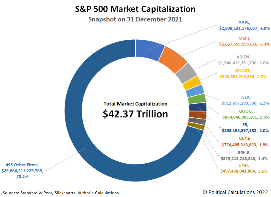
At the end of 2021, the companies that make up the S&P 500 (Index: SPX) were collectively worth $42.37 trillion. The 10 stocks that make up the largest components of the market capitalization weighted index accounted for 29.5% of that value. The following chart shows their share of the market cap of the whole index:
The other 495 firms in the S&P 500 have a collective market capitalization of $29.86 trillion.
Here is the list of the top 10 components of the S&P 500 index as of 31 December 2021:
- Apple (NASDAQ: AAPL)
- Microsoft (NASDAQ: MSFT)
- Amazon (NASDAQ: AMZN)
- Alphabet (A) (NASDAQ: GOOGL)
- Tesla (NASDAQ: TSLA)
- Alphabet (C) (NASDAQ: GOOG)
- Facebook (NASDAQ: FB)
- Nvidia (NASDAQ: NVDA)
- Berkshire Hathaway (B) (NYSE: BRK.B)
- United Healthcare (NYSE: UNH)
The top two firms, Apple and Microsoft, had market caps that were nearing $3 trillion each, with Apple briefly exceeding that value in early January 2022. If we combined the market cap for the two classes of Alphabet stocks, the firm formerly known as Google would have a market cap in excess of $1.8 trillion, which would rank third. Separately however, the individual Alphabet stocks rank fourth ($0.92 trillion) and sixth ($0.85 trillion) for their market cap in the S&P 500 index among the individual stock listings.
The undivided Amazon ranks third for individual stocks with a market cap of nearly $1.5 trillion. Tesla ranks fifth at $0.91 trillion, with its market cap squeezing in between the two classes of Alphabet shares. Facebook came in seventh at $0.85 trillion, graphics chipmaker Nvidia was eighth at $0.77 trillion, followed by re-insurer/conglomerate Berkshire Hathaway at $0.57 trillion.
Closing out the list, United Healthcare had a market cap of just under $0.50 trillion, edging out JP Morgan Chase (NYSE: JPM), which it replaced in the S&P 500's top 10 stocks since our August 2021 update.
References
Standard and Poor. S&P 500 Index Earnings and Estimates. [Excel Spreadsheet]. Accessed 31 December 2021.
Standard and Poor. S&P Market Attributes. [Excel Spreadsheet]. Accessed 31 December 2021.
Slickcharts. S&P 500 Companies by Weight. [Online Database]. Accessed 31 December 2021.
Ycharts. S&P 500 Market Cap. [Online Database]. Accessed 31 December 2021.
Labels: market cap, SP 500
When Joe Biden was sworn in as President of the United States on 20 January 2021, the U.S. national debt stood at $27.76 trillion. One year later, the total public debt outstanding of the U.S. government has ballooned by nearly $2.11 trillion (or 7.6%) to $29.87 trillion.
Perhaps a better question to ask is to whom does the U.S. government borrow owe all the money it has borrowed?
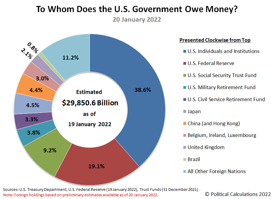
The following chart illustrates who the U.S. government's biggest creditors are as of the end of President Biden's first year in office along with the portion of the national debt they are owed.
The Overall Picture
The U.S. Federal Reserve is once again Uncle Sam's single largest creditor, accounting for 19.1% of the entire U.S. government's national debt. The Fed's share of the total public debt outstanding has grown from 16.5% a year earlier.
By contrast, the U.S. government's second largest creditor is Social Security, whose share of the ownership of the national debt dropped from 10.4% of the total to 9.2%. Social Security has been running in the red since 2009, forcing its Old Age and Survivors' Insurance Trust Fund to sell off U.S. treasuries it accumulated when it was operating in the black in order to keep paying out benefits at promised levels. Social Security's share of the U.S. national debt is projected to decline to 0% in 2034. After that happens, Social Security benefits will be reduced by somewhere between 20-25% as promised under current law.
The retirement trust funds for the U.S. government's military and civilian employees together account for 7.1% of the total U.S. national debt. After these large holdings, a diverse range of U.S. institutions, such as banks, insurance companies, independent corporations, investment firms and individuals combine to hold the largest share of money owed by the U.S. government, accounting for 38.6% of the total, down from the 40.4% share they held a year ago.
Foreign entities combine to account for holding 25.9% of the total debt liabilities issued by the U.S. government, up from the share of 25.4% they held on 20 January 2021. Of the portion of the national debt owed to foreign-based institutions, Japan now holds the greatest share at 4.5% of the U.S. national debt based on preliminary estimates, whose share is unchanged from a year earlier. China comes in second holding a share of 4.4%, which is down from 4.6% in 2021.
The international banking centers of Belgium, Ireland, and Luxembourg saw their share of the U.S. government's total public debt outstanding held steady at 3.0%, while the United Kingdom saw its share increase from 1.5% to 2.1% over the past year. Brazil and the remaining foreign nations saw their shares of the U.S. national debt dip.
President Biden's First Year in Office
As we noted, the national debt increased by $2.11 trillion in President Biden's first year in office. That amount was inflated by President Biden's American Rescue Plan Act, which we estimate accounts for $1.34 trillion or 63.5% of the increase by itself.
The following waterfall chart breaks down where most the money the U.S. government newly borrowed in President Biden's first year in office came from:
We find the Federal Reserve loaned Uncle Sam 45% of all the net new borrowing. Foreign entities loaned the U.S. government the second largest amount at 33% of the net change, while U.S. individuals and institutions contributed the remaining 22%.
About the Data
These figures represent the most current information available as of 20 January 2022, which for the total public debt outstanding is fully current through 20 January 2022. The Federal Reserve's holdings is current through 19 January 2022, data on U.S. government entity holdings is current through December 2021, and data for foreign holdings is based on estimates through November 2021 that were published on 18 January 2022.
Labels: data visualization, national debt
When we say the bottom dropped out of the S&P 500 (Index: SPX) last week, what does that really mean?
It seems obvious that we're referring to the decline in stock prices, but there's much more to it than that. After all, the stock market has weeks when its value rises and has weeks when its value falls from the previous week, but we don't claim the bottom has dropped out of the index every time the latter situation happens. What makes the trading week ending 21 January 2022 different?
It wasn't the rate at which stock prices declined. On no single day of the holiday-shortened trading week did the S&P 500 drop by more than 2% of their previous day's closing value, the volatility threshold we use for any given day's trading to qualify as being interesting.
Nor did the overall 8.3% decline of the index since its 3 January 2022 record high qualify as interesting, falling less than the 10% threshold that it would take to qualify as a correction in stock prices according to professional traders. By both these definitions, what happened in the Nasdaq composite index (Index: COMP) during the past three weeks qualifies as interesting, but not so much for the more diverse S&P 500.
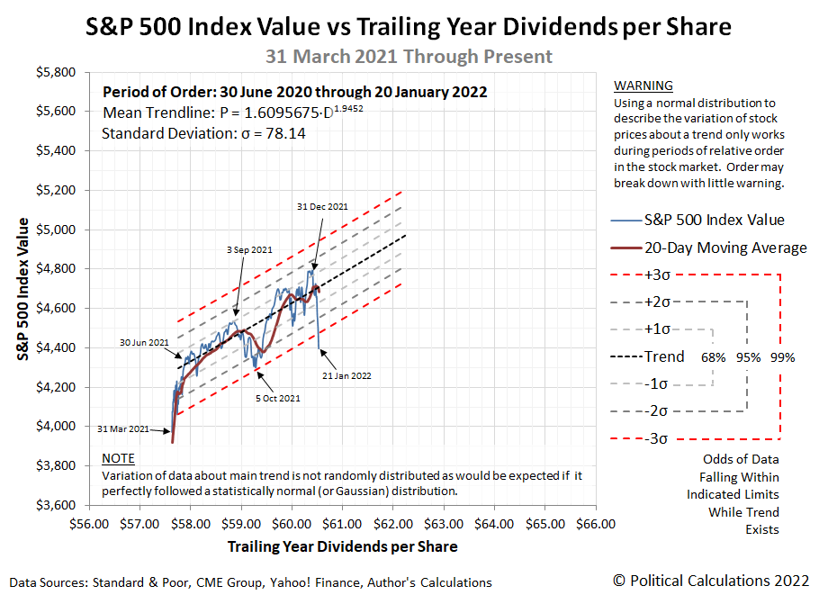
Instead, our observation has a lot to do with how stock prices were behaving in recent months. Here, let's start with the latest update to our chart showing the S&P 500's periods of relative order and chaos, which now covers the full 30-year period from December 1991 through December 2021.
According to a long-standing set of technical definitions we developed, here's how we define when a period of order exists in the market:
Order exists in a market whenever the change in the price of assets in the market are closely coupled with the change in the income that might be realized from owning or holding the assets, within a band of approximately normal variation about a central tendency.
In the case of the stock market, the assets are stocks, the price of which is given by the value of the S&P 500 index. The income that might be realized from owning or holding the assets are dividends, represented in the chart by the index' trailing year dividends per share.
When we refer to these two things being closely coupled, we mean when both the value of the S&P 500 and the index' trailing year dividends per share are either rising or falling together in a general trend. When that coupling exists, the variation of stock prices about a mean trend line can be approximately described by a normal distribution.
Looking at the most recent period of our 30-year chart, we see the period from March 2021 through December 2021 could reasonably qualify as a period of order according to our definition. Both stock prices and dividends per share have both been rising during these months.
Our next chart zeroes in on this period with daily data, where we confirm a close coupling exists in the period from 30 June 2021 through the end of 2021 and into January 2022.
We've added statistical control chart-style thresholds to the chart to visualize a statistical hypothesis test. Here, when stock prices fall within three standard deviations of the mean trend, order can be said to exist for the S&P 500. Once stock prices fall outside that range indicated by the red dashed lines, we reject the hypothesis that order exists in the market.
On 21 January 2022, we see the level of stock prices drop below that key statistical threshold. We confirm order has broken down for the S&P 500 in this analytical approach and has done so by breaking through the lower limit of the range we would expect to find stock prices had the short established period of relative order in the U.S. stock market not broken down. This backward-looking approach confirms the similar assessment we arrived at using a forward-looking model.
To put it more colorfully, the bottom has dropped out of the S&P 500.
And now you know why we can say that! Now the question has become "is what happened on 21 January 2022 an outlier event and the trend still holds, or has it truly broken down?" We'll learn the answer to that question as early as this week.
Previously on Political Calculations
Labels: chaos, data visualization, dividends, SP 500, stock market, stock prices
Do you remember 3 January 2022? On the first trading day of the year, the S&P 500 (Index: SPX) closed at an all-time record high of 4,796.56.
Since then, the index has fallen by 398.62 points (or 8.3%), with two-thirds of that decline in the past week. On the alternative futures chart, that drop during the past week looks like bottom dropping out with the trajectory of the S&P 500 shooting below the dividend futures-based model's lowest projections for this period.
On a side note, it's not just this chart showing the bottom dropping out of the S&P 500. We have another chart that will better drive that point home, which we'll present in a separate analysis.
Since Friday, 21 January 2022 saw atypically large values of options expiring, the jury is still out on how much noise that contributed to the market's action, so we're paying especially close attention to the new week's trading activity. With that event in the past, we should get a clearer signal on where stock prices are heading in short order.
We're also paying attention to how we might need to reset the level of the dividend future model's multiplier, which is something we've anticipated since December 2021 might become necessary with the Federal Reserve altering its monetary policies. That's in addition to paying attention to the market-moving headlines as they hit the newstreams, where we noted the following stories in the past week.
- Tuesday, 18 January 2022
- Signs and portents for the U.S. economy:
- Oil prices hit 7-year highs; Mideast unrest stokes supply jitters
- New York state factory activity slumps in January amid Omicron surge
- Bigger trouble developing in Australia, Eurozone, Canada, Mexico:
- Australian consumers shellshocked as Omicron hits spending, growth
- Euro zone consumers in for a shock as power bills soar
- Even as Omicron slams Canada, bets on January rate hike rise
- Mexico economy slips in December, hinting at weak close to 2021
- Bigger stimulus developing in China, Germany:
- China cuts rates on policy loans, analysts point to more easing ahead
- China has plenty policy tools in reserve to cope with slowing economy - state planner
- China cenbank to roll out more policy moves to stabilise growth
- Germany to help companies shoulder higher power costs
- BOJ minions on board with inflation, ECB minions standing by to someday leap into action:
- BOJ raises inflation forecasts but rules out policy tightening
- ECB can adapt policy faster if high inflation persists - Villeroy
- Wall St sinks as yields spike, financials fall after Goldman miss
- Wednesday, 19 January 2022
- Signs and portents for the U.S. economy:
- U.S. mortgage interest rates climb for 4th straight week
- Oil highest since 2014 as Turkey outage adds to tight supply outlook
- Big U.S. banks see higher expenses from workers' rising wages
- Bigger inflation developing in France, UK, Japan, Canada, Russia:
- "Good" French economic growth not hit by Omicron but inflation too high - Villeroy
- UK inflation hits near 30-year high, pressuring BoE and households
- Japan govt panel member joins BOJ in highlighting inflation risk
- Canada's annual inflation rate hits 4.8% in Dec to three-decade high
- Russia working on financial stability as Kremlin decries 'unacceptable' inflation
- Bigger stimulus developing in China:
- Wall Street sell-off deepens, Nasdaq confirms correction
- President Biden's press conference goes very badly, in a way that might lead oil prices to spike and hurt the economy:
- Thursday, 20 January 2022
- Signs and portents for the U.S. economy:
- As inflation breaks records, $100 oil is also looming
- Oil prices slip from 2014 highs, supply concerns limit losses
- U.S. existing home sales tumble in December
- U.S. weekly jobless claims at three-month high; seen trending down as Omicron subsides
- Fed minions thinking about tomorrow:
- Fed kicks off debate on issuing its own digital currency with new white paper
- Fed may run fast on long road to normal balance sheet
- Bigger stimulus developing in China:
- China says will roll out more steps to boost effective demand - state media
- China cuts key rates, steps up monetary stimulus to boost economy
- ECB minions counting on inflation going away on its own:
- Wall Street drops as bargain-hunting tapers off
- Friday, 21 January 2022
- Signs and portents for the U.S. economy:
- U.S. crude exports ramp up as global demand recovers
- Aluminum cans to jet fuel: inflation dominates U.S. corporate earnings
- Treasury Secretary tries gaslighting to save failing Biden policy proposals:
- Bigger stimulus developing in China:
- China will appropriately step up policy support for economy -premier
- China caps weekly policy easing blitz with fresh rate cuts
- BOJ minions notice inflation, will think about stuff they can do about it:
- Japan's inflation hovers around 2-year high, BOJ flags price pressure
- Japan's Kishida says up to BOJ to decide on exit from easy money policy
- S&P 500, Nasdaq post worst weeks since pandemic start as Netflix woes deepen slide
As of 21 January 2022, the CME Group's FedWatch Tool projects quarter point rate hikes in March 2022 (2022-Q1), June (2022-Q2), July (2022-Q3), and December (2022-Q4).
It's January, which means the airwaves are cluttered once more with advertisements for weight loss programs and physical fitness equipment. But in much of the world, icy and snowy winter weather makes it difficult for those suddenly obsessed with weight loss to go outside to pursue the physical activities they're counting on to fit back into the clothes they wore before the holidays. If only there was a patented invention that could help!
You're in luck, because not only is there such an invention, it's 101 years old! Inventor Tom Doroszuk was issued U.S. Patent 1,324,342 for his innovation combining bicycle technology with sleigh technology to produce the Bicycle Sleigh:
Doroszuk's invention merges a bicycle frame onto a larger structure supported on a tricycle of skis. When the rider peddles the bicycle sleigh, it turns a paddlewheel mounted in place of the rear bicycle to provide propulsion on snow-or-ice-covered surfaces. So not only can you can you get exercise on the Bicycle Sleigh, you can get to where you're going when the roads are covered with snow and ice!
Or rather, you could theoretically get exercise and get to where you're going, if only the Bicycle Sleigh existed in today's world. We couldn't find so much as a single TikTok or YouTube influencer willing to bring their version of the now public domain-invention to life.
We did however find the next closest thing: ski bikes, which are really a thing, if only useful for going downhill!
Time will tell if the 21st century see a bicycle sleigh revival.
Inventions in Everything: The Archives
But wait, there's so much more! Our archives, now fully updated through 2021, celebrate inventions ranging from the whimsical to the inspired in reverse chronological order!
- Inventions in Everything: The Santa Claus Detector
- Inventions in Everything: Sled Pants
- Inventions in Everything: Pure Nightmare Fuel
- Inventions in Everything: Carvable Artificial Pumpkin
- Inventions in Everything: Artificial Intelligence-Generated Patents
- Inventions in Everything: How to Comfortably Carry $1 Million in U.S. Banknotes
- Inventions in Everything: Lawnmowing Trikes for Tykes
- Inventions in Everything: A Third Eye for Smartphone Zombies
- Inventions in Everything: The Beerbrella
- Inventions in Everything: George Dempster's Innovation
- Inventions in Everything: Motorcyclist Airbag Suit
- Inventions in Everything: Patented Improvements in Cat Toys
- Inventions in Everything: Drinking on the Go for the Environmentally Conscious
- Inventions in Everything: The Hoverbrella
- Inventions in Everything: Inflatable Concrete Containers
- Inventions in Everything: Better 2D Maps of a 3D World
- Inventions in Everything: The Lost Patent of a Bold Man of Color
- Inventions in Everything: Bulletproof Underwear
- Inventions in Everything: A Blazing Trumpet Performance
- Inventions in Everything: Slanty Toilets
- Inventions in Everything: The COVID Candy Chute
- Inventions in Everything: Tomatoes on the Run
- Inventions in Everything: Serving Coffee By Drone
- Inventions in Everything: HM Flying Saucer
- Inventions in Everything: Airbags for Mobile Phones
- "Similar to Fireworks, But a Lot Cooler"
- Inventions in Everything: Dinosaur Jaw Pliers
- Inventions in Everything: Oddly Shaped Objects That Roll Smoothly
- Inventions in Everything: Has the Time of the Isolator Arrived?
- Beauty Within An Eight Millimeter Square
- Inventions in Everything: Opening Doors in a Virus Filled World
- Inventions in Everything: PAPR Made With Truck Parts
- Inventions in Everything: Coffee Cups for Astronauts
- Inventions in Everything: Mechanical Trees
- Inventions in Everything: Space Age Baby Delivery
- Rediscovering Nature: A Biomimetic Clock
- Chairs to Haunt Your Dreams This Hallow's Eve
- Ten Million Inventions In Everything!
- Inventions in Everything: Shoes for Defying the Laws of Physics
- Inventions in Everything: Treadmills Inside Your Shoes
- Inventions in Everything: Makeup Applicator for Cat Eyes
- Inventions in Everything: Optical Illusions to Enhance Safety
- Inventions in Everything: The Future of Ironing
- Inventions in Everything: The Sock Slider
- Inventions in Everything: A Cold, Refreshing, CRISPR Beer
- Inventions in Everything: World's Brightest Flashlight and Glow-in-the-Dark Paint
- Inventions in Everything: On Track for Ten Million Patents!
- Happy Holographic Halloween!
- Elevators that Go Up, Down, Left and Right....
- Inventions in Everything: Ice Cream Pint Lock
- Slow Dance
- Inventions in Everything: Training Device for Beer Pong
- Inventions in Everything: The Flask from the Future
- Inventions in Everything: The Music Playing Bag of Nacho Cheese Flavored Tortilla Chips
- Inventions in Everything: Floating Beer Pong Table
- Inventions in Everything: The Tree Transplanter
- Inventions in Everything: Stopping the Refrig-a-raider
- Inventions in Everything: Popping the Top on National Beer Day
- Inventions in Everything: Fishing for Boats
- Inventions in Everything: Suction Tube for Reverse Axial Withdrawal
- Inventions in Everything: The Unwelcome Mat
- Hubcaps to Replace Snow Chains
- Young AIs in Love
- Inventions in Everything: Rolling on the Vinyl Tracks
- Inventions in Everything: Drilling Square Holes
- The Singing Stones
- Inventions in Everything: The Future of Furniture
- Inventions in Everything: The WiFi Wig
- Inventions in Everything: Keeping Dog Time
- Drying Clothes With Ultrasound
- The Future of Fireworks
- Harvesting Water from the Air
- Inventions in Everything: Automated Window Blinds
- Inventions in Everything: Flying Snoopy!
- Inventions in Everything: Texting Your Dog a Treat
- Houseplants from Avatar
- The Kitchen Unitaskers You Cannot Live Without
- Inventions in Everything: The Baby Cage
- Self-Carving Pumpkins
- Inventions in Everything: The Alarm Clock of Damocles
- Death to Mosquitoes!
- Reinventing the Axe
- Automated Zen
- The Ultimate Swiss Army Knife You Can Buy Today
- Inventions in Everything: The Toilet Snorkel
- There Is No Great Snowplow Stagnation
- The Ultimate in Rust Proofing
- Billionaire Drinks Sewage: Video
- Inventions in Everything: Antiterrorism Barriers
- Wrapping Your Bike Around a Tree... On Purpose
- Inventions in Everything: Geothermal Beer Coolers
- Inventing a Better Snowshoe
- Inventions in Everything: The Salmon Cannon
- Powdered Wine: Just Add Water!
- Fail: The Newest Innovation in Ice Cream
- Unlimited Virtual Legos
- Inventions in Everything: The Ultimate Turkey Blind
- Inventions in Everything: Turning Cans Into Sippy Cups
- Inventions in Everything: Anatomical Lego Figures
- It's Not What You Think....
- Inventions in Everything: Soup Bowl Attraction
- Inventions in Everything: Making Life More Difficult
- Inventions in Everything: The Oreo Separator Machine
- Air Shark!
- Markets in Everything: Stormtrooper Motorcycle Suit
- The Bike That Rides You
- One Inventor's Stick-to-itiveness
- High Five!
- Inventions for Everything
- The Best Mousetrap Ever
- An Invention for the True Wine Connoisseur
- Three of Ten Things You Don't Need on St. Patrick's Day
- The Future Just Got a Lot Cooler Than It Used to Be
- The Worst Piece of Design Ever Done
- The Magic Marker of the Future
- Coming Soon, to a Gym Near You!
Labels: technology
There are few products as iconic as Campbell's Condensed Tomato Soup. Since being invented in 1897 and introduced to American consumers in 1898, Campbell Soup (NYSE: CPB) has produced, marketed, distributed, and successfully sold billions of Number 1 cans filled with condensed tomato soup.
Political Calculations has compiled the price history of Campbell's Condensed Tomato Soup going back to January 1898. We've tracked the price of Campbell's iconic tomato soup over the past 124 years because of its remarkable consistency as an identifiable product over time. In fact, if you had a time machine and could travel to nearly any point in time from January 1898 to the present, you could likely find a 10.75 ounce size can of Campbell's condensed tomato soup stocked for sale in American grocery stores.
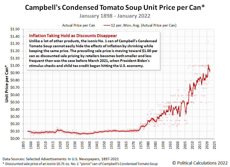
That long-running consistency makes Campbell's Condensed Tomato Soup an ideal product to follow to understand how inflation has affected American consumers through its history. Today, we're updating our chart visualizing that history from January 1898 through January 2022.
For the latest in our coverage of Campbell's Tomato Soup prices, follow this link!
In January 2022, we find the prevailing sale price is moving toward $1.00 per can as discounted sale pricing by U.S. retailers has become both smaller and less frequent than was the case before March 2021, when President Biden's inflation kicked off, fueled by the stimulus checks and advance child tax credit payments he implemented after coming into power.
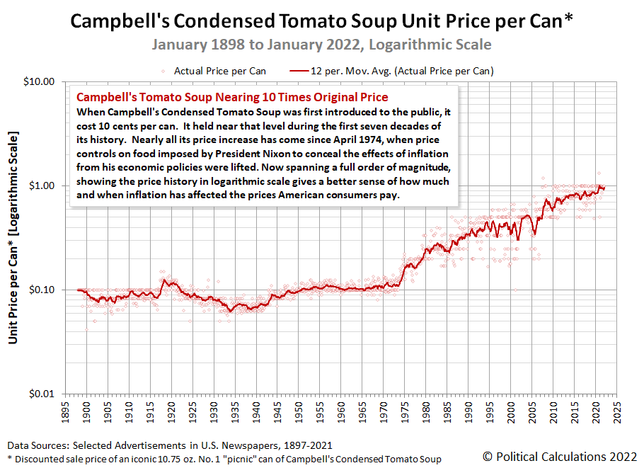
That's ten times the original price American grocery shoppers paid when the Campbell company began selling their just-invented condensed soup products in 1898. Because its price history spans a full order of magnitude, showing the price history in logarithmic scale gives a better sense of how much and when inflation has affected the prices American consumers pay for Campbell's Condensed Tomato Soup.
Speaking of what American consumers are seeing when they go shopping for tomato soup in January 2022, many are seeing empty grocery shelves. The following two photos were snapped at the same Walmart location one week apart earlier in the month. They show the regular shelf spaces for where shoppers would expect to find Campbell's tomato and chicken noodle soups. If they're in stock, which you'll see was not the case on 7 January 2022, but were on 14 January 2022, though supplies on the later date were limited.
During soup season, Walmart will often have a special aisle-display for these soups. That was not the case on either of the dates these photos were taken. What these photos indicate is that Walmart, the largest food retailer in the U.S. by volume of sales, is having trouble keeping its shelves stocked with Campbell Soup's top two-selling soups. That's not the case at other grocery stores in the same area, which shared one characteristic: their shelf prices for Campbell's Condensed Tomato Soup are higher than Walmart's $0.98 per can price.
Update 23 January 2022: Our field correspondent reports the Walmart location whose shelves are pictured above succeeded in more fully restocking its supply of Campbell's condensed tomato and chicken noodle soups.
We're also not seeing the same kinds of discounted sale pricing we observed a year ago. The absence of discounts confirms the presence of inflation for Campbell's tomato soup that wasn't present a year ago.
Previously on Political Calculations
Political Calculations' analysis of Campbell's Tomato Soup dates back to 2015! Along the way, we've filled in the gaps we had in the historic price data and have explored America's second-most popular soup from a lot of different angles.
- The Price of Campbell's Tomato Soup Since 1897 (2015)
- The Tomato Soup Standard (2015)
- The First Ad Ever for Campbell's Condensed Tomato Soup (2015)
- War and Soup (2015)
- Working Backwards from Retail to Cost (2015)
- Early Advertising Milestones for Campbell's Condensed Soups
- Updated: The Price of Campbell's Tomato Soup Since 1897 (2016)
- Everyday Low Prices (2017)
- Soup and Recession (2017)
- Soup and Steel Tariffs (2018)
- Tomato Soup, Oil and Inflation (2018)
- Celebrating 150 Years of the Campbell's Soup Company (2019)
- The Price History of Campbell's Tomato Soup (2020)
- Campbell's Tomato Soup Sales Soar as Americans prep for Home Quarantines (2020)
- Campbell's Soup Presents "The Magic Shelf" (2020)
- The Price of Campbell's Tomato Soup in the Coronavirus Pandemic (2021)
- The Pandemic Price Escalation of Campbell's Tomato Soup (2021)
- Shrinkflation and a New Tool to Track Price Inflation in Real Time (2021)
- Absence of Discounts Confirms Tomato Soup Inflation (2021)
- The Ship of Theseus and Campbell's Tomato Soup (2021)
- The S&P 500 and Campbell's Tomato Soup (2021)
- Upward Price Pressure at the Start of Soup Season (2021)
- Recent Price Trends for Campbell's Tomato Soup (2021)
Labels: data visualization, food, inflation, soup
Welcome to the blogosphere's toolchest! Here, unlike other blogs dedicated to analyzing current events, we create easy-to-use, simple tools to do the math related to them so you can get in on the action too! If you would like to learn more about these tools, or if you would like to contribute ideas to develop for this blog, please e-mail us at:
ironman at politicalcalculations
Thanks in advance!
Closing values for previous trading day.
This site is primarily powered by:
CSS Validation
RSS Site Feed
JavaScript
The tools on this site are built using JavaScript. If you would like to learn more, one of the best free resources on the web is available at W3Schools.com.
